Brand & press
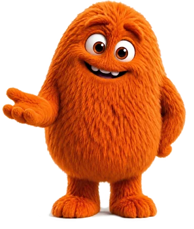
This is Squint.
Squint is the NumoForms mascot: a large orange fluffy monster drawn in
two poses — waving (full body, for heroes) and
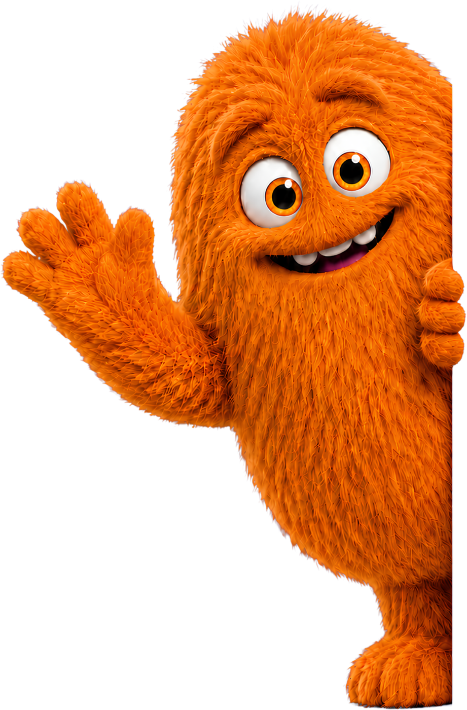
peeking (cropped at his left edge, so he leans in from
the right of a container). The primary brand purple is
#4f46e5; Squint's fur is orange,
#ff8500. The two are a deliberate contrast,
not a family — he sits against the brand purple rather than in it. He
must never appear inside a form or beside a partner logo.
The name
The product is NumoForms. In running text after a first mention, NumoForms alone is fine. It is one word, capital N, no hyphen, no space, never all-caps outside a logotype, and never abbreviated to initials. The legal entity is NOISSIME LTD — company number 17160439, registered in England and Wales — which is the form to use in contracts, procurement records and anything with a footnote.
The mascot is Squint, capital S, no article: "Squint waves at you", not "the Squint". He has no surname and no backstory we are prepared to invent for you.
The character
Squint reacts, he does not narrate. He belongs at moments — the hero, an empty state, a finished survey, the 404 — rather than standing beside every paragraph pointing at it. Mascots die by overuse, so on content pages he appears once, or not at all. This page is the single exception, because it is his page and showing both poses is the whole job of it.
He is decorative by default. In markup that means alt="" and
aria-hidden="true", so a screen reader skips him rather than
announcing a monster in the middle of a sentence. He gets a real
description only where he carries meaning the surrounding text does not —
on this page, for instance, where he is the subject rather than the
decoration. That matters because the tool is built for public-sector
consultations, which are held to WCAG 2.2 AA; the
accessibility feature page covers
the rest.
The poses
Three of these still have a white background baked in rather than transparency. They sit correctly on the white site, but will show as a white box on the deep purple or in the footer. Use the transparent poses there until cut-out versions exist.
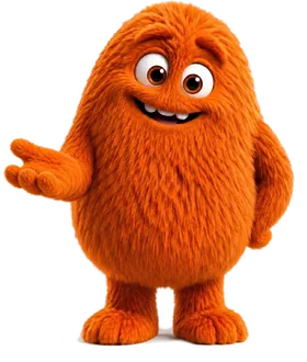
Waving
Full body, feet visible, trimmed tight to the artwork. Use where he has room to stand — heroes, empty states, the 404. Centre him, and give him space rather than tucking him behind text.
squint-monster-waving.png 1641 × 1935, transparent PNG
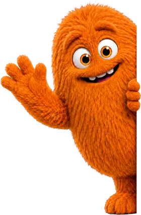
Peeking
Drawn cropped at his left edge, so he only reads correctly flush against the right-hand side of a container, leaning in and overlapping the boundary. Centred in white space he looks like a mistake, because he is half a monster.
squint-monster-peeking.png 921 × 1400, transparent PNG
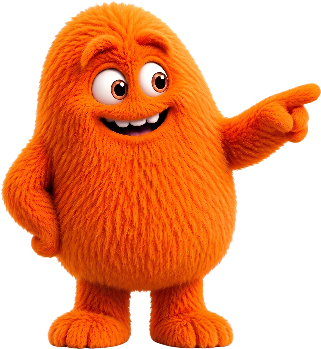
Pointing left
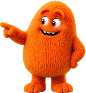
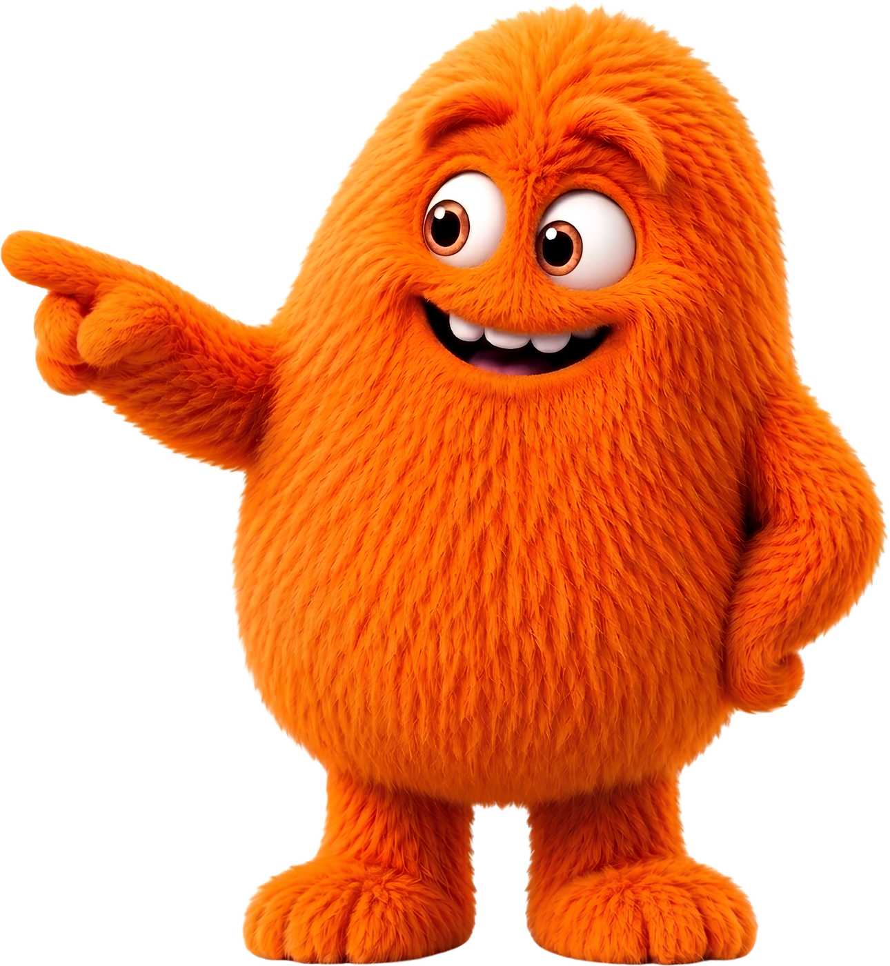
He points to his own left, so place him to the RIGHT of whatever he indicates. Pointing at nothing, or off the edge of the page, is the fastest way to make a mascot look daft.
squint-pointing.png 1290 × 1400 · white background, not yet cut out
Pointing right
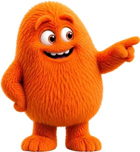
The mirror. Place him to the LEFT of what he indicates. Between the two there is always one that points inwards at the content rather than off the page.
squint-pointing-right.png 1290 × 1400 · white background, not yet cut out
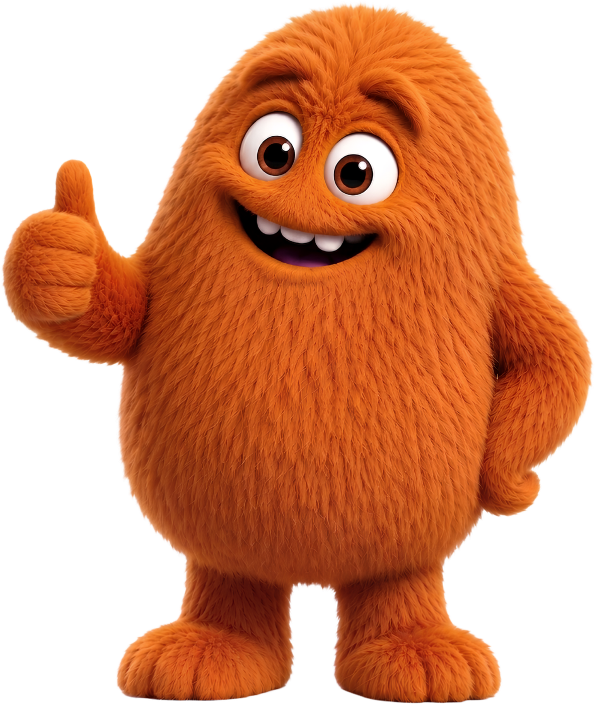
Thumbs up
For success and completion — a submitted survey, a saved setting, a thank-you screen. Not for marketing claims: approval from the mascot is not evidence of anything.
squint-thumbsup.png 1185 × 1400 · white background, not yet cut out
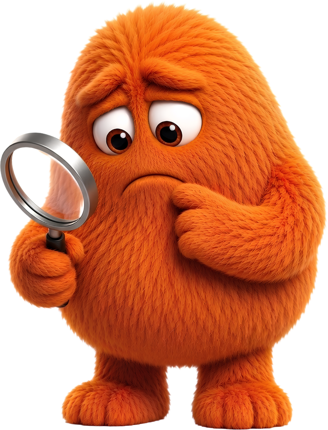
Searching
Puzzled, with a magnifying glass. For the 404 and for empty states — anywhere someone was looking for something that is not there. Not for errors that are our fault; a confused mascot beside a server error reads as flippant.
squint-searching.png 1068 × 1400 · white background, not yet cut out
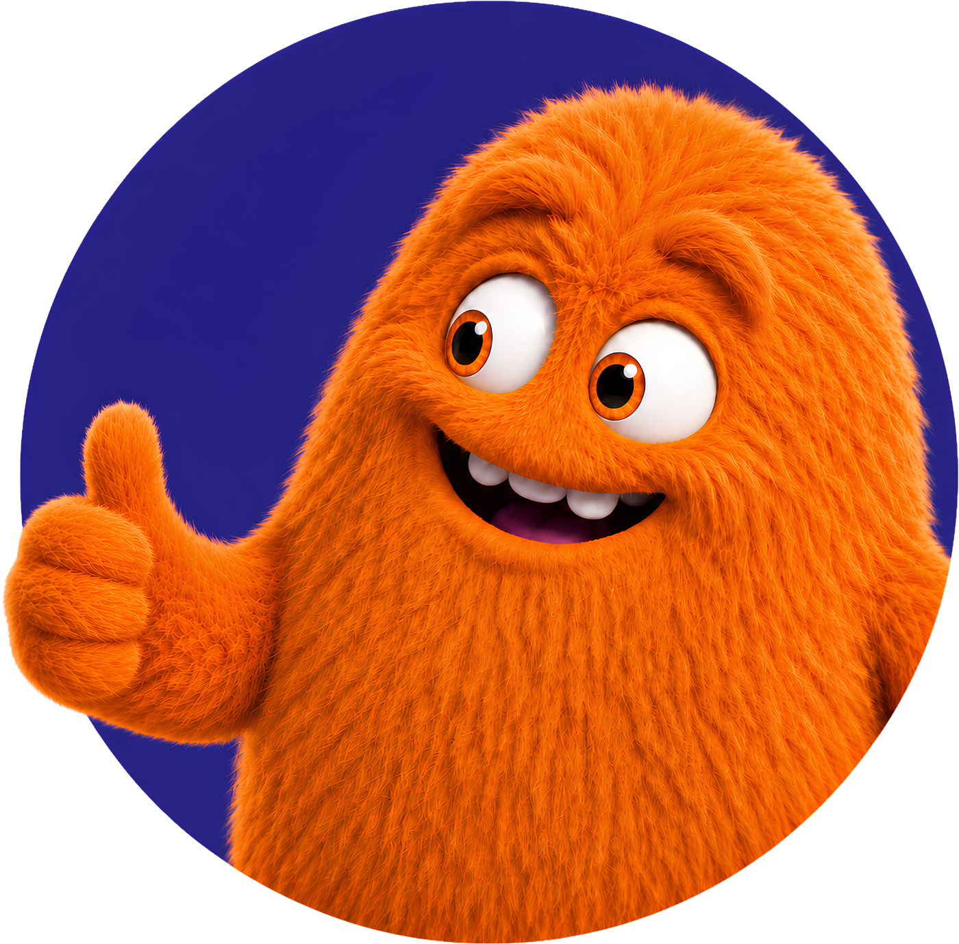
Badge
Squint inside a filled circle. Use where a round crop is wanted — an avatar, a favicon, or as one of the decorative circles. The circle is part of the artwork, so never add a second ring around it.
squint-badge.png 1400 × 1377, transparent PNG
The logo
A bar mark and the NOISSIME wordmark, locked together. It is a wide lockup at roughly 6.5:1, so size it by height and let the width follow — setting a width and letting the height fall out is how it ends up two pixels tall in a footer.
There are two files and no others. The dark wordmark on light backgrounds, and the white wordmark on anything dark. Do not recolour it, do not add a shadow, and do not place the dark version on the deep purple.

Dark wordmark
For white and light backgrounds. The default.

White wordmark
For the footer, the call-to-action block, and any dark surface.
The circles
Solid filled circles in the badge purple and the brand purple, used as background texture. They are the same shape as Squint's badge, just empty — which is what ties the decoration to the character rather than leaving it as generic ornament.
Three rules. They are always solid, never faded or blurred; a soft blob reads as a lighting effect rather than a mark. They only ever sit in white space, anchored outside the content column and growing outward, so an enormous one runs off the page edge instead of across the text. And they vary in size — a page of identical circles looks like a pattern library rather than a composition.
They drift on scroll at several speeds to give a sense of depth. Like all motion on this site, that stops entirely when the visitor has asked for reduced motion.
Correct use
- Transparent background, always. He sits on several different colours.
- Scale him proportionally. Never stretch, squash, skew or rotate beyond a slight tilt.
- Keep him whole, except for the deliberate crop in the peeking pose against a container edge.
- Leave clear space around him of at least the width of his raised hand.
- One instance per page on content pages.
Incorrect use
- Never inside a form, or a mock-up of one. A cartoon monster next to a question about someone's income or health is the wrong register, and respondents are not our audience for brand personality — they are people trying to finish something.
- Never beside a partner, client or council logo. Because co-branding is per survey, collaborator logos belong on real consultations. A fluffy monster next to a council crest undercuts both marks. Partner logo strips are a Squint-free zone.
- Do not recolour him. His fur tokens are sampled from the artwork; a green Squint is not Squint.
- Do not add drop shadows, glows, outlines or a baked-in background box.
- Do not redraw, trace, animate a new pose, or generate variants of him.
- Do not use him to imply endorsement by anyone other than us.
Colour
Every colour on this site comes from a CSS custom property in
tokens.css. The values below are read from that file at build
time, so what you see here is what the site actually renders. The brand
purple is deliberately identical to the accent colour inside the
application — if one moves, both move, or the handover from site to
product feels like two companies.
Note that the accent colour is themeable per survey inside the app, so the purple is our colour rather than something every respondent sees.
Badge purple
The deep purple inside the circular Squint badge, and the fill for the decorative circles. Sampled from the artwork so the shapes and the character belong together.
Brand purple
The primary. Identical to the accent in the app, which is the point — site and tool must read as one product.
Deep purple
Dark section blocks and reversed-out type. Never used for body text.
Squint fur
Sampled from the artwork, not invented. Warmer and deeper than the brand purple so he does not dissolve into the interface.
Squint shade
His underside and cast shadow.
Squint light
Lit fur and rim light.
Squint tint
Background wash for panels he sits on.
Ink
Body text. Not black.
Canvas
Page background in light mode.
Typography
Headings are set in Plus Jakarta Sans at weight 800, with tight tracking and a line height below one — the bold, compressed look is doing a lot of the brand's work. Body text is Inter. Both are loaded from Google Fonts. If you are reproducing the brand somewhere those are unavailable, a heavy geometric sans for headings and any neutral grotesque for body text will not embarrass anyone.
Describing the product
A one-line description you may quote directly:
A survey builder with conditional logic, scoring, matrix questions and per-survey co-branding. Responses stored in London.
Two things to avoid if you are writing about us. First, there are no customer numbers, uptime figures or completion-rate statistics to quote, because none have been published — if you have seen one attributed to us, it is not ours. Second, we hold no ISO 27001 certificate and have not completed a SOC 2 audit; the security page says so in its second paragraph and describes the controls that do exist instead.
Asking for something else
There is no full press kit archive, no logotype file yet and no photography. If you need an asset that is not on this page, or you want to check a use that the rules above do not obviously cover, email us via the contact page. Permission for anything unusual is worth asking for and usually granted; using the artwork in a way that suggests a partnership that does not exist is the one thing that is not. More about who is behind this is on the about page.